
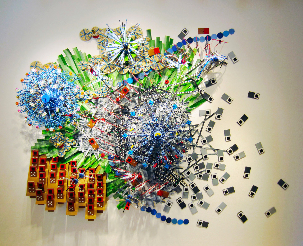
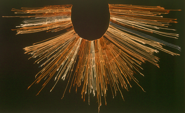
Data Visualization is one of the places where art and science naturally combine– it’s a creative way to collect and synthesize information. Children/students can apply their knowledge and demonstrate comprehension without quizzes or worksheets. In its simplest form, data visualization is the graphic representation of data using color, shape, symbols, length, thickness, placement etc. It encourages children/students to think like scientists and collect data and then to use their creative brain to display it in a visually pleasing way. You can find examples throughout history ranging from Incan Quipus (a complicated system of knotted ropes historically used to store data or knowledge) to Natalie Meibach (a contemporary artist who makes large woven sculptures with climate data).
A fun example of a data visualization that you may already use is the 1000 Hours Outside Hours tracker. When you physically color in each hour you spend outside you become so much more aware of that time than if you were just making a list of numbers. Here are some more easy examples of data visualization:

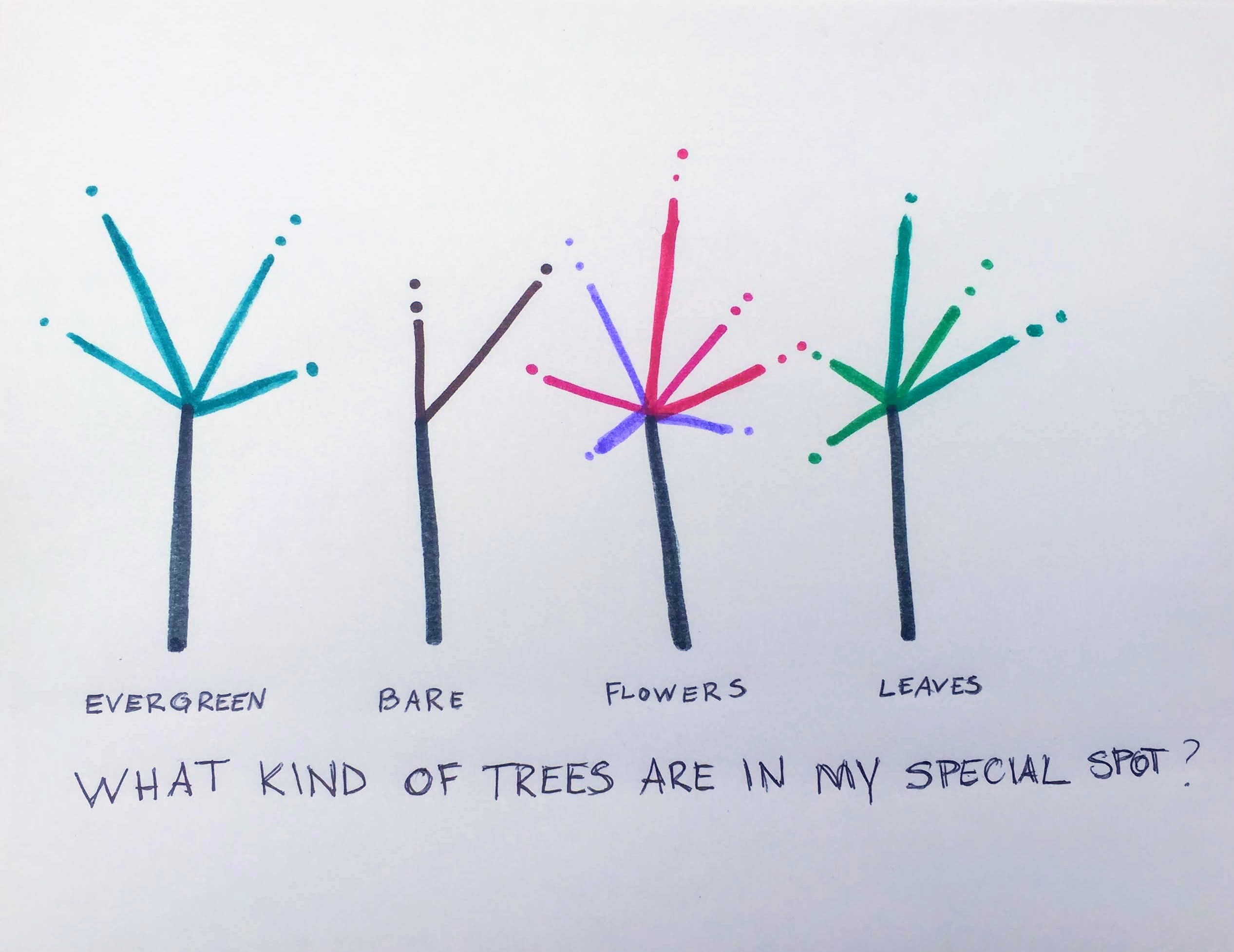
Click here for an easy data visualization printable that you can download and try out in your journal!